
Bleubird: a logo that has appeared on every product since 2017
What it takes for a mark to last, and how it grew into positioning, messaging and guidelines for an outdoor lifestyle brand.
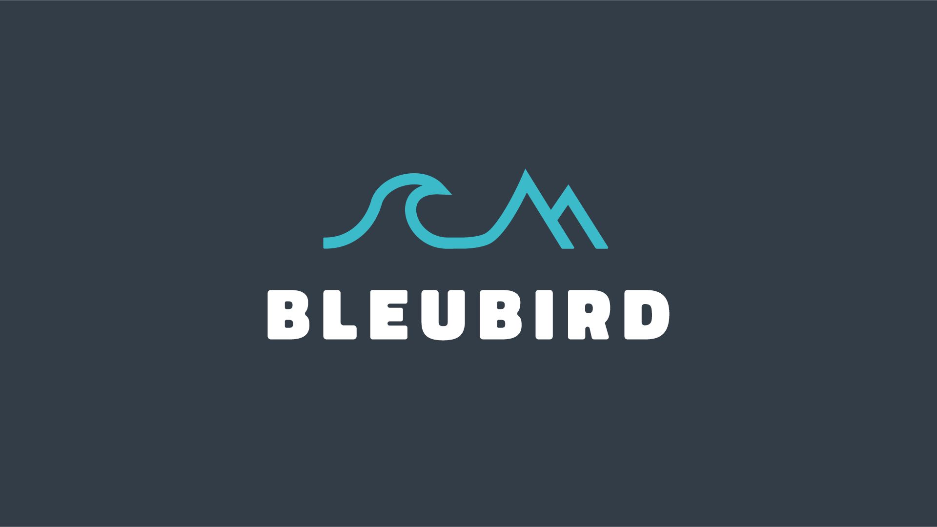
Bleubird makes premium everyday clothing for people who live outdoors. The brand’s outlook is ‘at one with the elements’: durable, functional and built on timeless craftsmanship.
A mark designed to last
The original Bleubird logo was designed in 2017. Since then it has appeared on every product, hangtag, piece of packaging and campaign the company has produced. The work behind it included careful construction, colourways and a colour palette, and the mark was later refined to sharpen it without losing what people already recognised.
“The mark he created has appeared on every product, every hangtag, every piece of packaging and marketing material we’ve produced. It’s still going strong and truly represents the brand.”
Matt Creighton, Founder, Bleubird
From logo to brand system
As the range has grown, the work has grown too. It now covers positioning, messaging and guidelines that keep a growing product range consistent, from swing tags and brand illustration to campaigns like Adrift.
What makes a logo last
- It’s simple enough to work small, on a label or a tag.
- It reflects what the brand believes, not a passing trend.
- It’s backed by guidelines, so it’s used the same way every time.
See the full Bleubird case study, or find out about logo design.