

Haymarket: bringing trust and clarity to property management
How a wordmark, an H mark and a poster campaign gave a block management company a credible, modern presence.
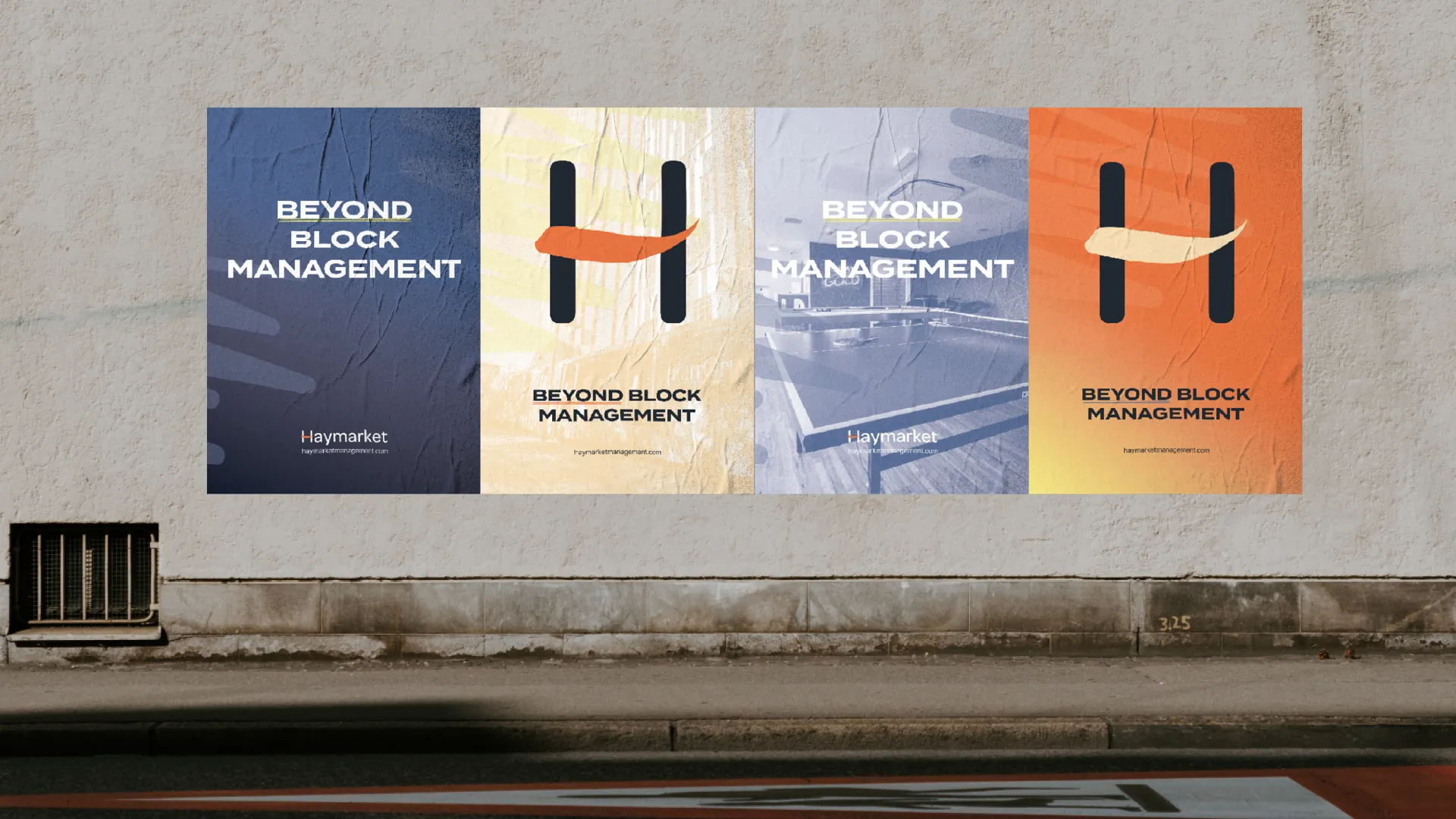
Haymarket is a client-focused block management company. Property management isn’t always a sector people trust, so the aim was to redefine trust and clarity through purposeful design.
A mark with meaning
The identity includes a wordmark and an H mark built around three ideas: people, process and results. Giving a mark a clear meaning helps a team explain the brand and live up to it.
Going beyond
A poster campaign, ‘Beyond block management’, takes the brand out into the world on walls and outdoor posters. Notebooks and business cards carry it into everyday meetings.
For service businesses in crowded sectors
If your industry has a reputation to overcome, your brand can do some of the heavy lifting. A credible, modern presence tells people you’re different before you’ve had the chance to prove it.